Building and developing a distinctive and visionary brand.
Axielab designs physical and visual spaces at 360°, working on panels, shop windows, LED walls, and brand identities — with the goal of attracting major clients while also engaging emerging young talents.
We supported Axielab Design Innovation Studios in the development of a branding and integrated communication project. We created a strong and coherent visual identity, defined the brand strategy, designed a representative logo, and applied the visual system across both digital and physical media.
We developed a custom color palette and designed the website, ensuring a consistent and easily recognizable visual identity.
Brand identity
From idea to signature.
Starting from the client-provided naming and the need to build a solid and recognizable digital presence, we analyzed the competitive landscape and brand values to develop a clear, personal, and coherent visual identity.
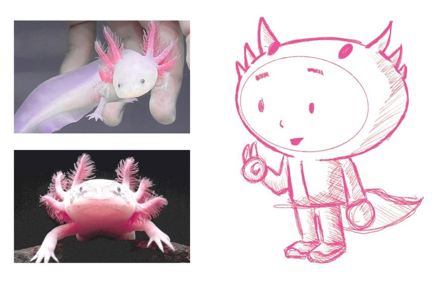
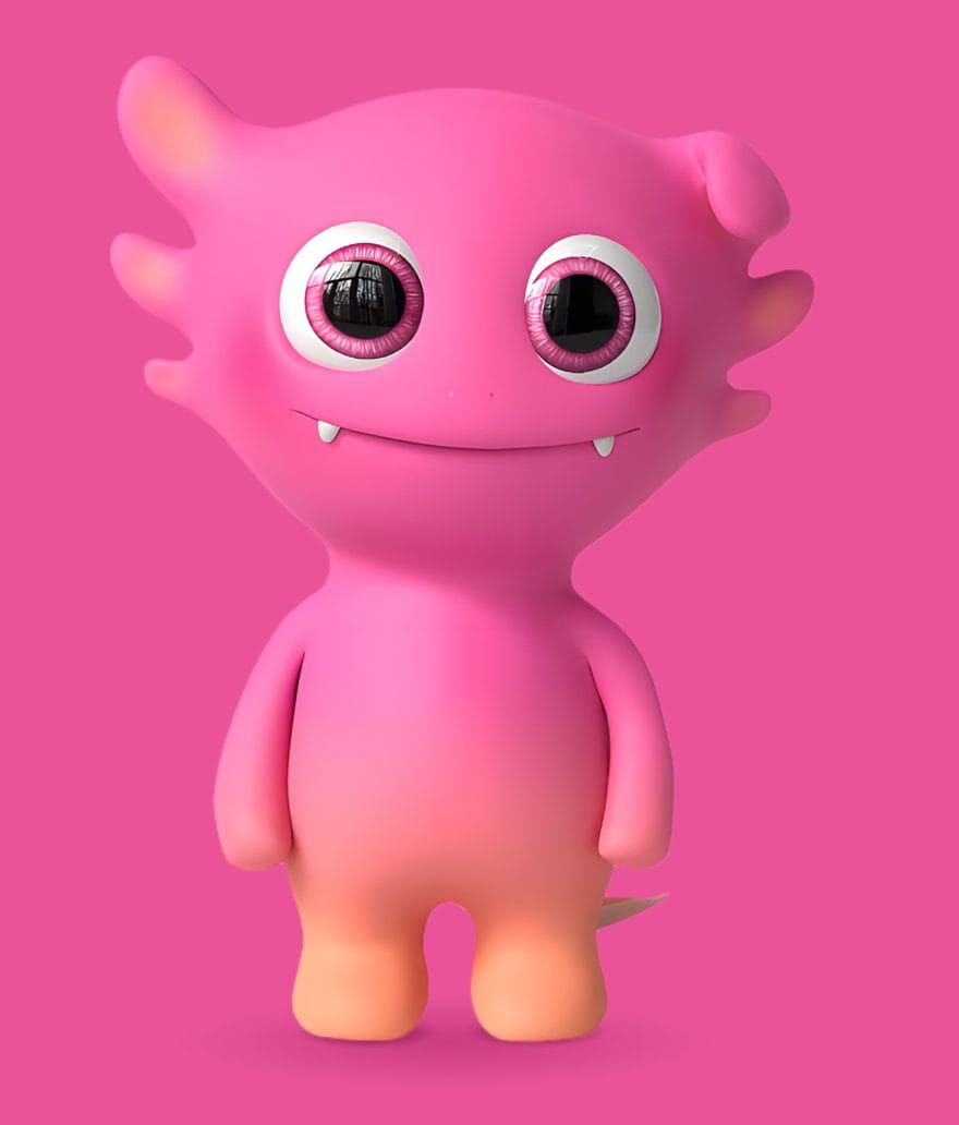
Guided by communication trends and the playful tone of the name, we created a mascot: an axolotl — a symbol of creativity, adaptability, and uniqueness — which became the starting point for the entire visual and narrative ecosystem of the project.
Concept
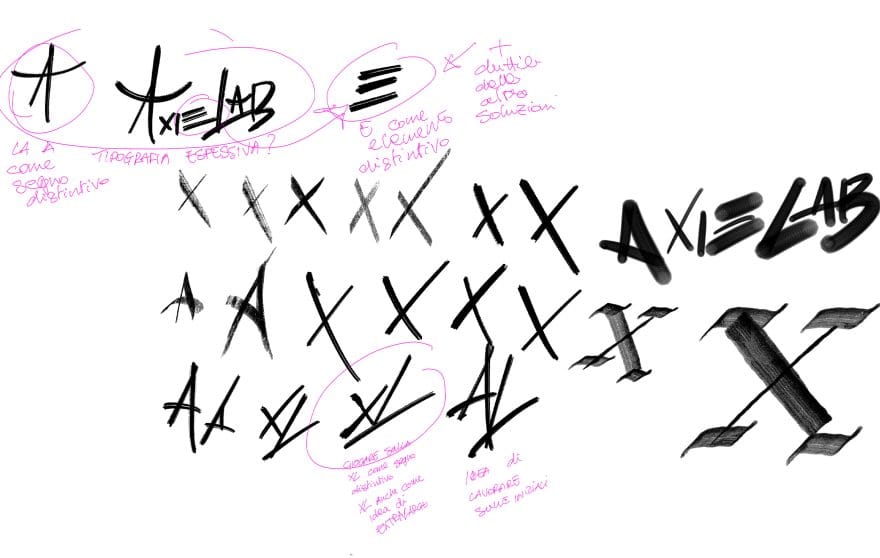
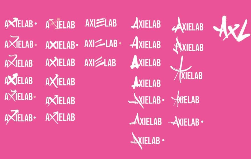
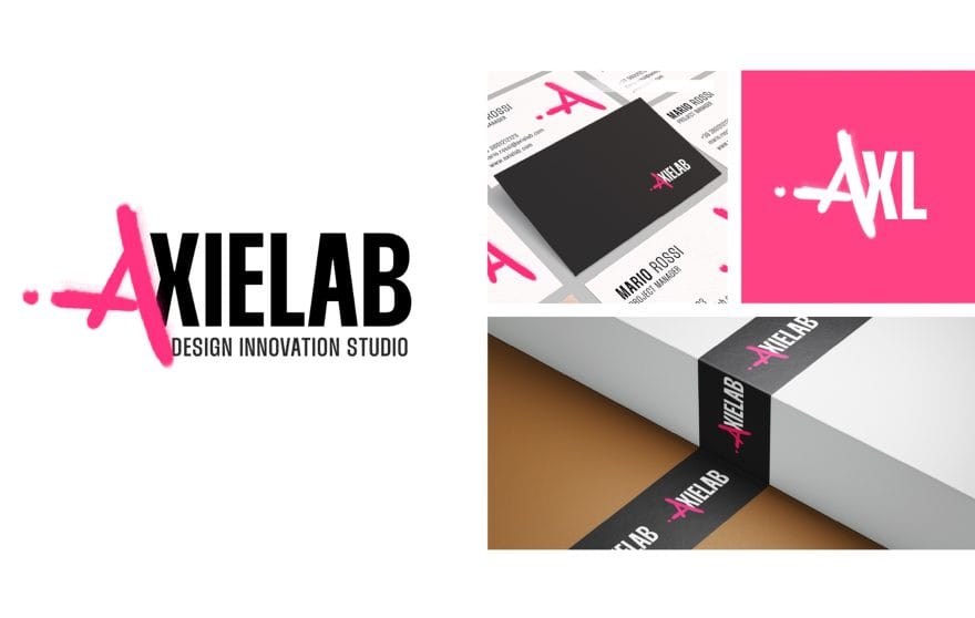
The “A” as an urban signature.
For this project, we started from a key concept: movement. A movement that is young, dynamic, and digital. From this foundation, we explored various creative directions, each with a precise focus, until we defined a visual identity that balances immediacy and control, instinct and strategy.
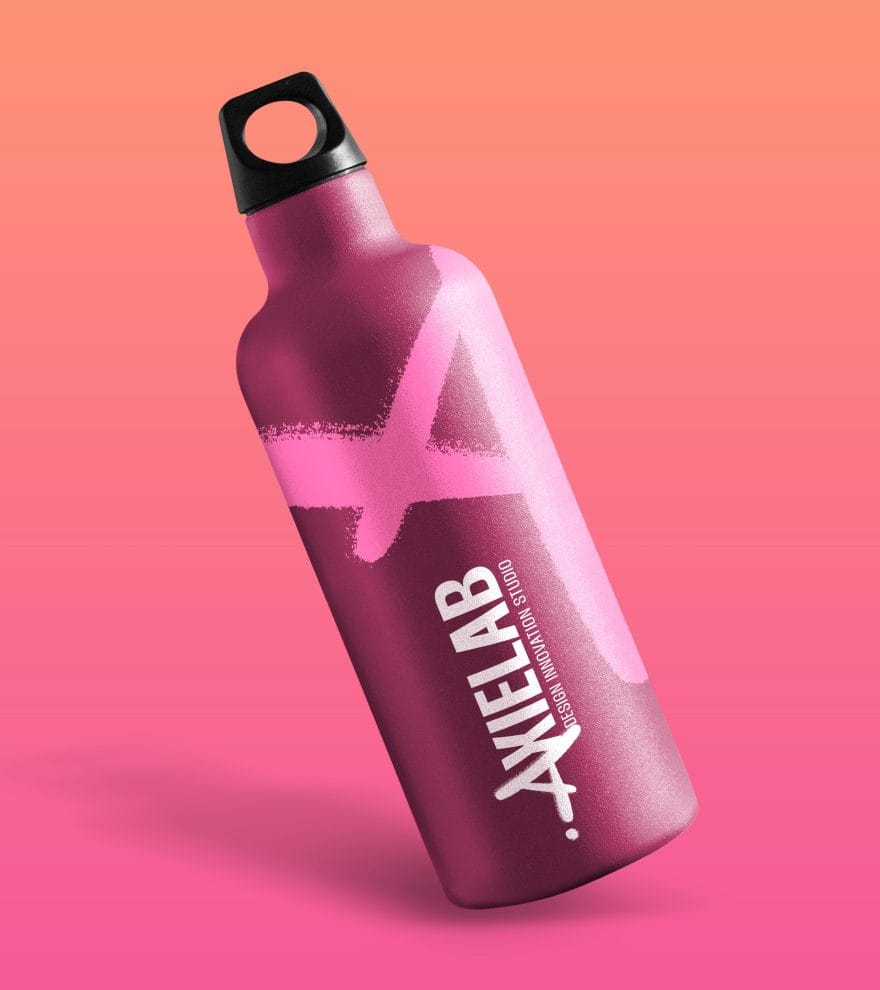
The result is a fast, impactful graphic system that remains balanced, legible, and functional. One of its central elements is the letter “A” from the name, transformed into a defining symbol.
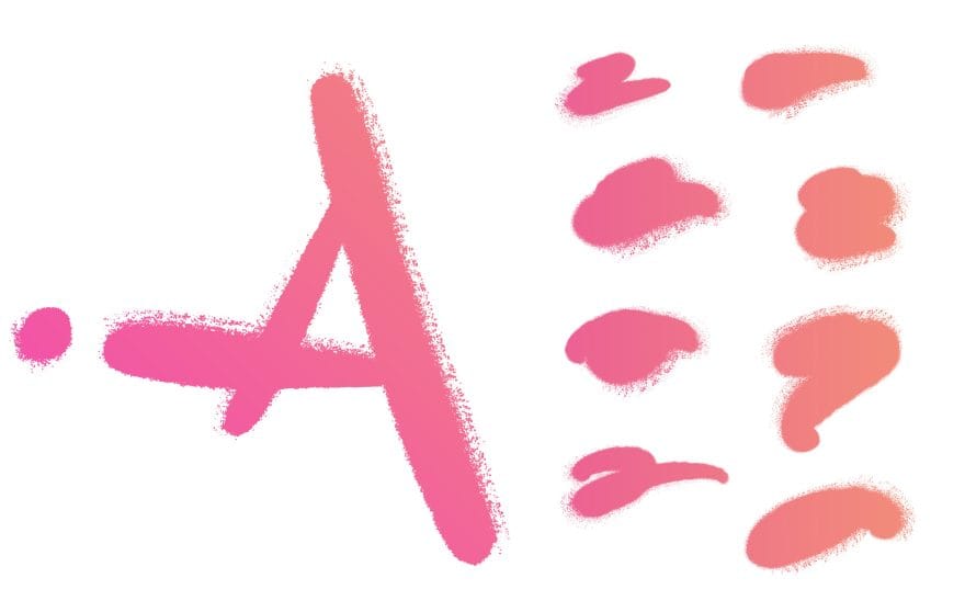
We treated it as an emblem, enriching it with a spray-paint texture — a choice that is not only stylistic but also conceptual. The texture evokes the world of street art, with a direct reference to Milan, a city that has long been a protagonist of this scene in Italy.
In this way, the visual identity becomes a bridge between digital and urban, between the speed of the web and the artistic expression of the streets. A living logo that speaks the language of its audience and territory.
Content
Visual tools for a complete identity.
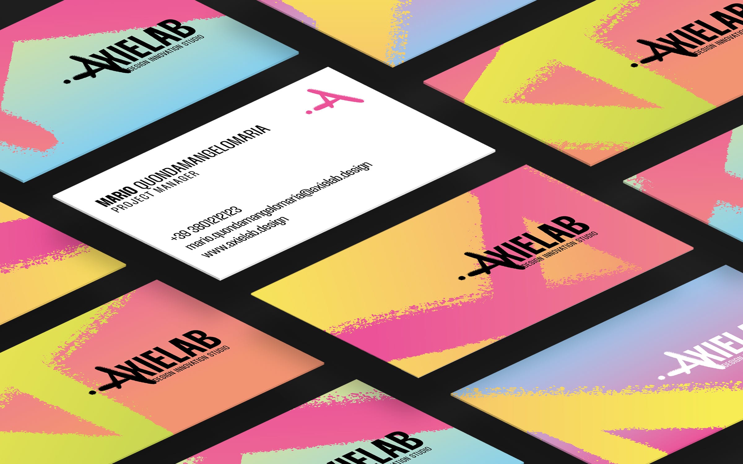
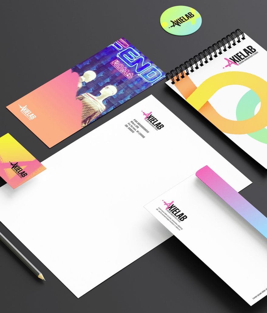
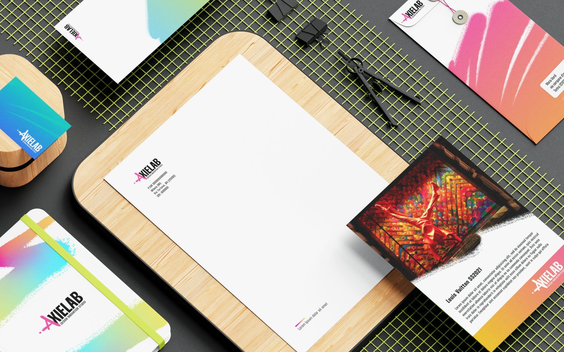
We crafted every detail of the visual identity, producing a complete brand manual and developing the mascot as a central element of the communication system.
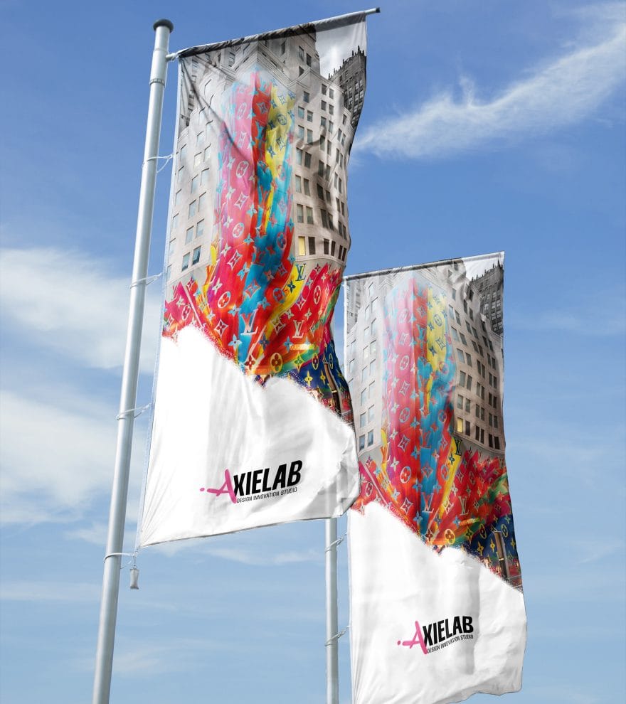
To support it, we designed all stationery materials: presentations, letterheads, business cards, and other coordinated assets — ensuring visual consistency and recognizability across every touchpoint.
Urban identity, digital creativity.
Dynamic branding between design and street art.
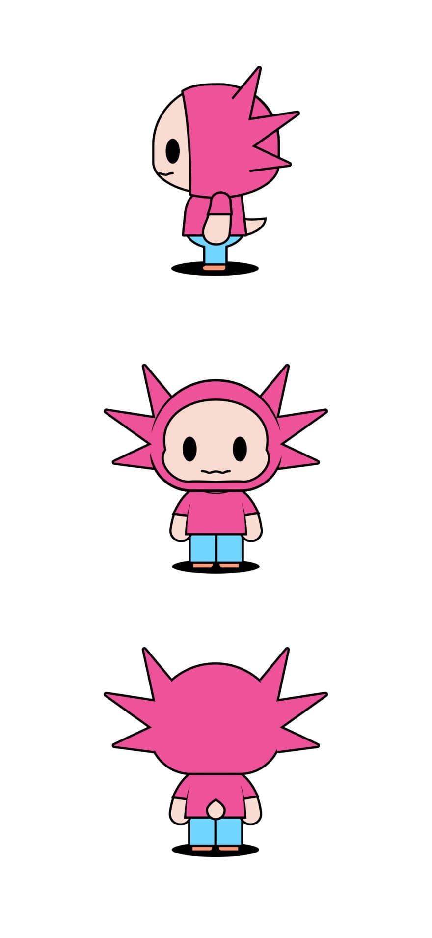
Axie, the face of the brand.
Mascot
Beyond the logo and coordinated image, we created Axie — a mascot designed to accompany the Lab in its identity and communication. Conceived as a versatile avatar, also with NFT potential, Axie was graphically developed to adapt to various applications: from digital materials to potential physical evolutions such as gadgets, animations, or installations.
UX/UI and development
The online extension.
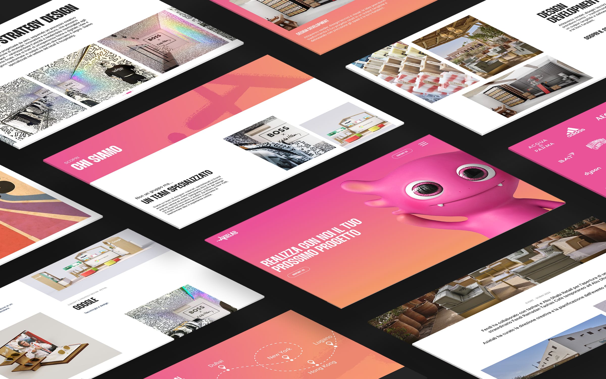
We developed Axielab’s website as a natural extension of the brand: an interface that faithfully reflects its structure, values, and personality. Every element was designed to ensure maximum usability, smooth navigation, and visual consistency with the developed graphic system. The core concept of movement was translated into an animated and responsive UI, with micro-interactions and dynamic elements that create an immersive and engaging experience.
The look and feel is young, fresh, and immediate — able to communicate directly with the target audience.
From the color palette to the animations, from layout to content, every detail of the site was designed to enhance the digital identity, creating a coherent, recognizable ecosystem ready to evolve across multiple touchpoints.
Colors and typefaces in motion.
Branding
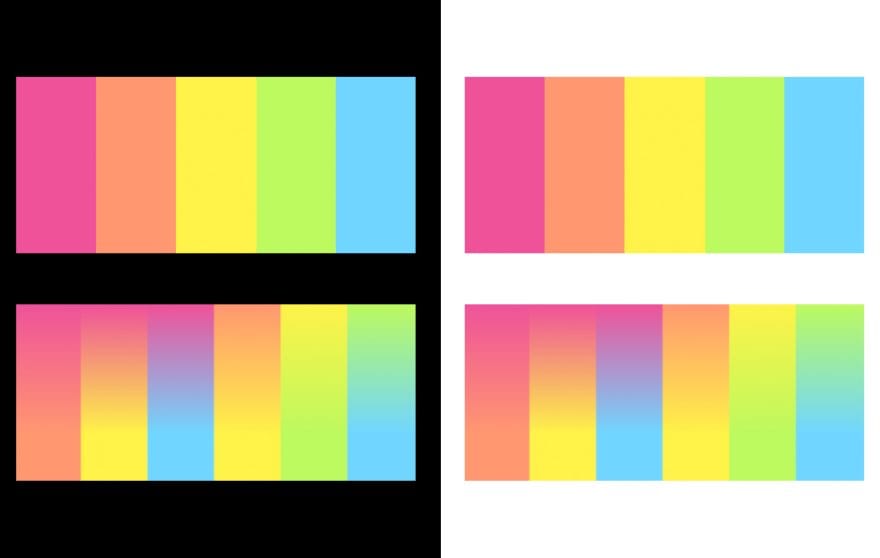
The color palette was inspired by the axolotl — the brand’s symbol — reinterpreted in a digital and contemporary key.
We built a chromatic system that blends naturalness and dynamism, with a primary gradient ranging from pink to salmon — vibrant colors that emphasize the concept of movement, a core element of Axielab.
For typography, we chose Thunder — a bold, impactful font perfect for headlines and visuals with strong communicative potential.
To complement it, Roboto Flex — versatile and essential — lightens the visual hierarchy and ensures readability and functionality in every digital context.
The entire visual system was designed to balance expressive power and communicative clarity, translating the brand’s values into elements that can engage instantly across all channels.
soft black
#252525
rose bonbon
#ea5398
dark salmon
#f39472
white
#ffffff
Headings
Thunder
Paragraphs
Roboto Flex