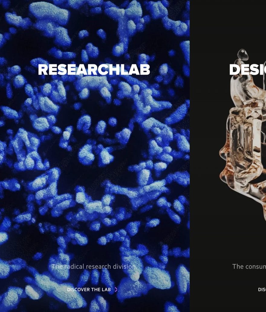
Innovative design for a company that creates cutting-edge materials for the future.
SAES Group is a leading company in the field of absorption and purification. We designed and developed their website, focusing on a minimalist design and flawless user experience.
We conceived and implemented a user experience strategy aimed at increasing brand awareness and reinforcing the company’s positioning as an industry leader.
We also created a Digital Design System to ensure consistency, efficiency, and scalability in the development of the digital identity.
User interface
Scalable design system.
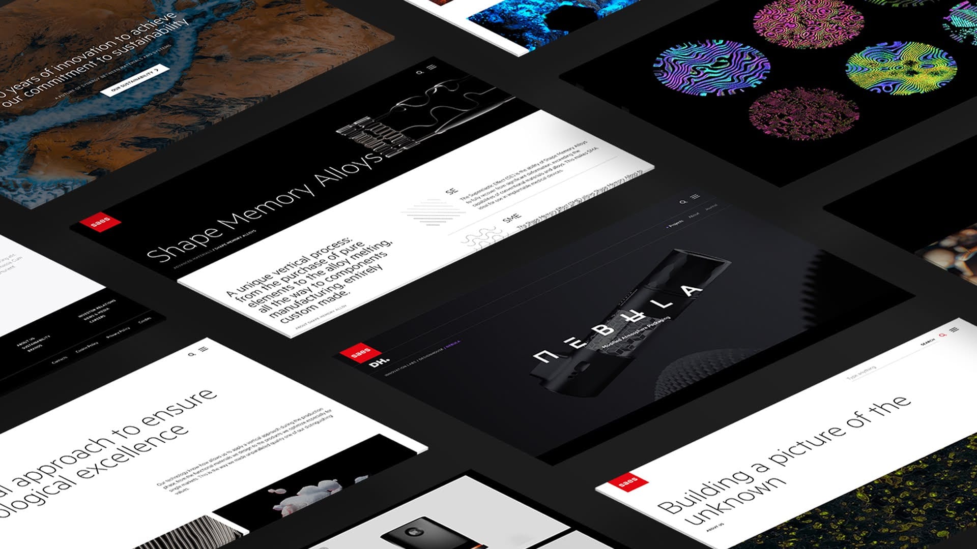
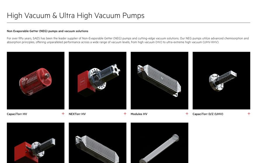
The SAES website was redesigned with a visually impactful layout that enhances the brand’s identity in every detail.
At the core of the project is a modular and scalable design system, allowing the site to evolve over time by adding content and features while maintaining strong visual continuity.
Colors, typography, and layout were chosen to create a fluid, immersive, and recognizable experience while maintaining high performance.

User experience
User experience at the heart of the journey.
User experience analysis was the starting point and central focus of the entire project. The SAES corporate site needed not only to clearly communicate the company’s positioning and market leadership, but also to narrate all its diverse business lines with precision and fluidity.
The main challenge was to design an accessible and intuitive experience for users with different profiles, needs, and engagement styles, while maintaining high levels of clarity, visual continuity, and informational quality.
Modular design, coherent identity, continuous evolution.
A flexible system that grows with the brand, suitable for telling every stage of its evolution without losing formal and structural balance.
Development
Design takes shape like matter in motion.
A clean and high-performing front-end architecture. HTML is semantic and accessible, CSS is modular and well-structured. Smooth sequential animations ensure elegant micro-interactions and optimized asynchronous loading.
The component-based system makes the code easy to maintain and scalable — ideal for a corporate project in constant evolution.
Advanced SEO for a global scientific brand.
SEO
The SAES website is built on robust SEO foundations: clear hierarchical structure, semantic URLs, clean code, and well-organized content.
The information architecture, designed to highlight each business area, supports effective positioning on strategic keywords.
Content
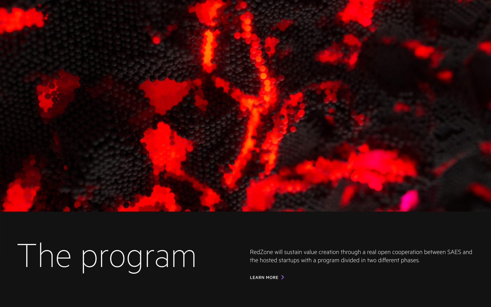
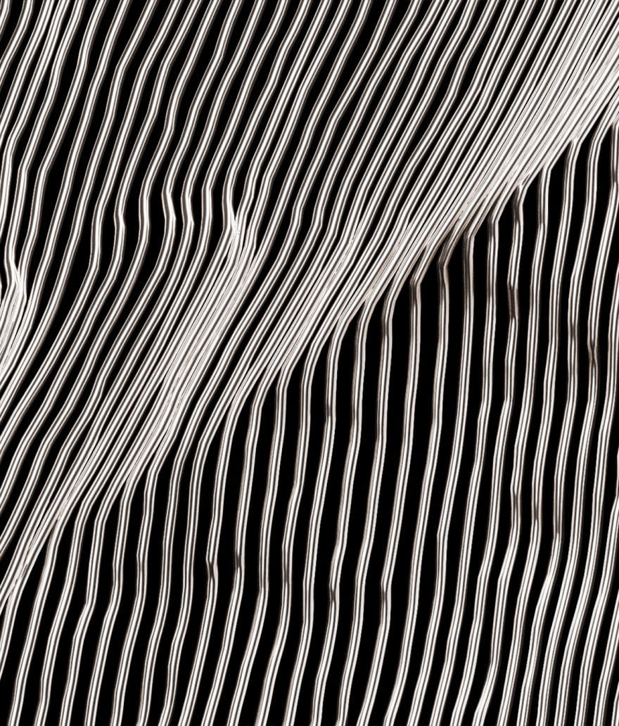
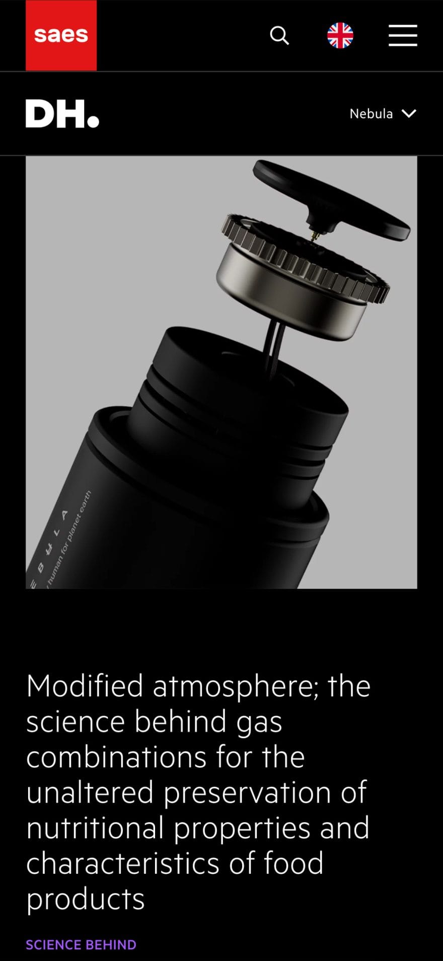
A visual narrative between matter and innovation.
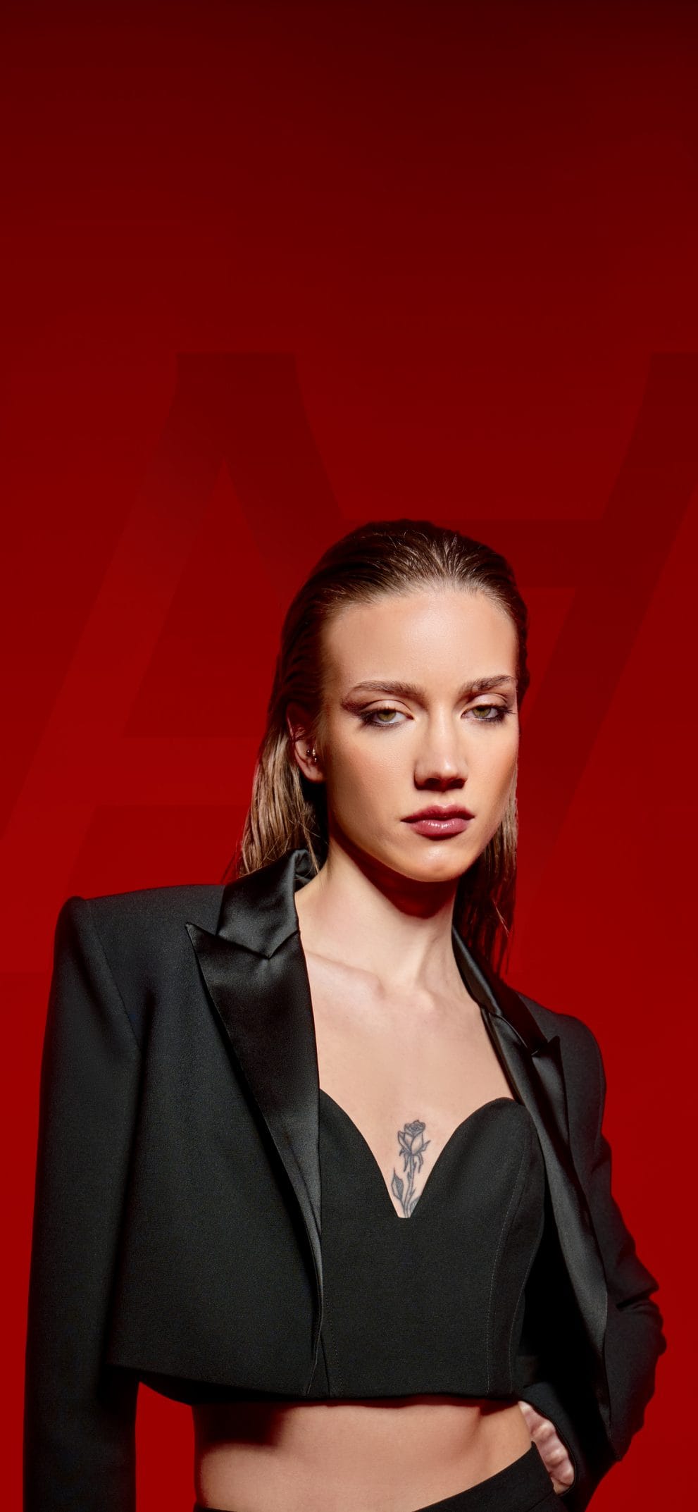
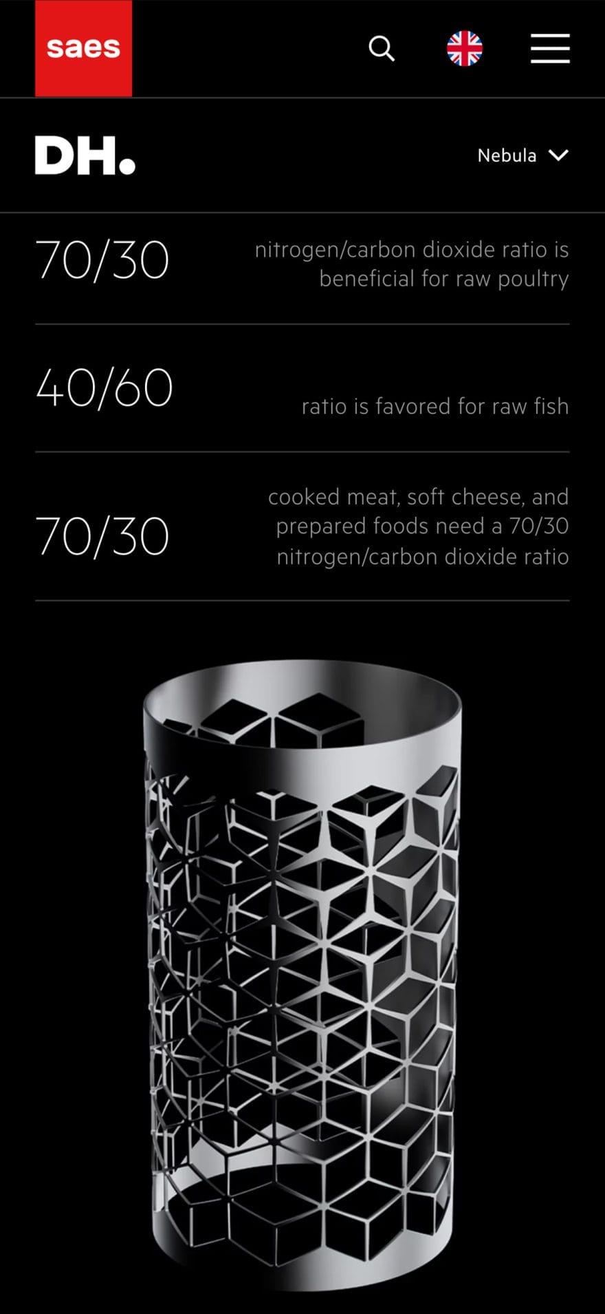
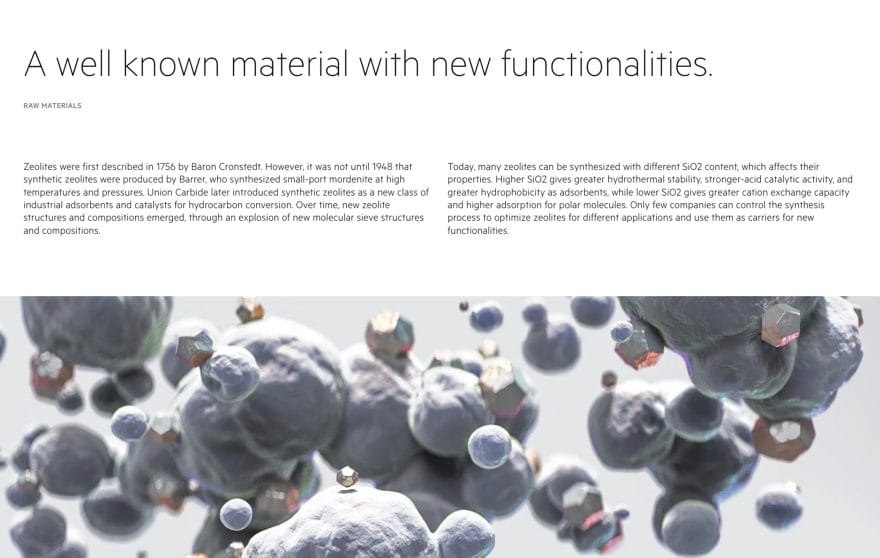
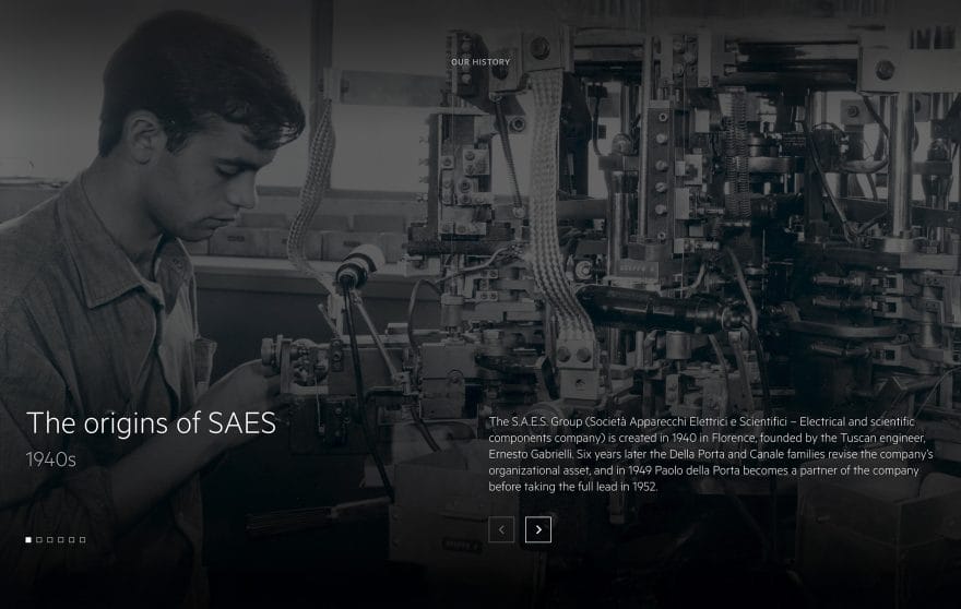
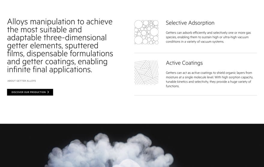
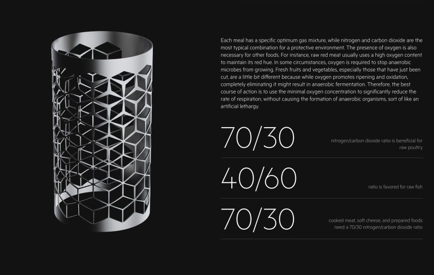
The content strategy was built around impactful imagery that evokes the brand’s scientific and technological identity.
Every visual element reflects matter, innovation, and SAES’s expertise, transforming the site into a dynamic and distinctive narrative where aesthetics and meaning merge to reinforce positioning.
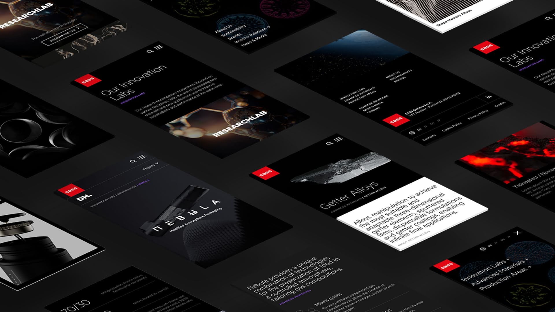
A digital visual language designed to evolve.
Branding
Matter, innovation, and science are translated into forms, rhythms, and hierarchies that create continuity between image and content. A visual ecosystem capable of evolving with the brand, while remaining recognizable, solid, and authentic.
The SAES project is driven by a strategic vision in which visual language is not just aesthetic, but a tool for relationship, structure, and positioning. Every choice is designed to speak the language of digital: clear, harmonious, adaptive.
black
#000000
oxyde black
#1a1a1a
SAES red
#e11e2e
white
#ffffff
Headings
Metric
Paragraphs
Metric